Mapping a distributed campus for the University of Cambridge
In 2011, the University of Cambridge needed to update its map services for visitors, new staff and students. Unlike most UK universities, it does not occupy a campus: it is spread across the city in 31 independent colleges, some as large as a campus university and some occupying several sites.
Its maps, online and on paper, were using technology that had become dated and hard to manage: innovative for its day but unable to meet the expectations of a mobile device orientated world. Moreover, the rate of change in new building developments and departmental organisation was stretching capabilities.
The University Computing Service decided the easiest way to address this was to start from scratch and commission a new map, based on OpenStreetMap data. Google Maps wasn’t really an option – depiction of university property was sparse, and even now detail is probably insufficient. So the choice was between DIY or OSM.
The flexible vector format, license arrangements, and crowd-sourced data made OpenStreetMap an excellent basis for mapping the University and coping with future expansion of both University and the wider city. Additional advantages were the flexibility and simplicity of the data model which made it easy to tailor to requirements; and the vector format which allowed for custom rendering, so a house-style presentation was possible. And the bargain worked both ways: OSM got highly detailed data normally inaccessible to mappers.
The new map was launched in September 2012
The new map project, code-named ‘Drake’, comprised:
- A methodology for assembling map data, including a taxonomy for university properties;
- Surveying all the University and college premises and adding them to OpenStreetMap;
- A web presence with dynamic searching, a zoomable, slippv map and APIs for providing maps in third-party web sites;
- A database to support institution contact information (in addition to the geographic data);
- A control panel and institution editor to assist making changes;
- Support, management, training and documentation;
- A draft paper version of the map including a comprehensive index; and
- Demonstrating how additional and private geographical data could be supported.
David Earl, a local mapper, was a good fit for the project as he had already done several paper maps based on OSM for the county council and had the right software qualifications. David found the hardest part of the project was getting permission from the Colleges to survey their property, which isn’t part of the University estate. “It wasn’t they didn’t want us to, it was just inertia in people replying to requests!”
Around 45 days were spent surveying: though this was only about 40% of the cost – software development consumed most of the rest. Consumer-grade GPS surveys were sufficient for the navigational purpose of the map but building density often blocked satellite signals so David complemented GPS surveys with tracing from Bing Satellite Imagery; using extensive ground measurements with a laser measure; and detailed notes and photographs.
By rendering from a map extract rather than directly from the live database, change can be controlled. Areas can be updated as required and maps can be previewed via the control panel before being published, so updates can get measure of quality assurance before publication – whether the data are derived from changes within the University or in the wider community.
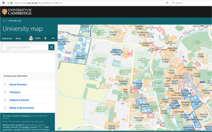
The Paper Map
Rendering a base map for printing presents challenges beyond producing online map tiles. By intercepting the rendering at the vector stage as an EPS file, it can be included in page layout software, in scalable form, providing for the more demanding resolution of the printing process.
The main challenge of producing the paper map was the index. The house style lists the institutions with a grid reference and a numbered, coloured cartouche, from which a corresponding numbered point symbol can be located on the map. Previously, all this information has been collated manually. The new map, however, automates this process almost entirely. A small program extracts index information from the institution and geographic databases and sorts it, generating graphic icons for the point symbols. It then populates the map and index with the point symbols and flows the text extracts to the index.
If elasticsearch had been available in 2011, David would have used it in preference to postgres as he thinks postgres is overkill. In particular, he thinks the postgres permissions model gets in the way, and elasticsearch has nice geolocation and replication facilities.
“You’d be amazed at the frequency of change. While not a full time job, it is definitely a part time occupation keeping the University estate up to date. And of course we all try to keep Cambridge as a whole up to date.”
David Earl
The policy of showing building names on the online map, not their occupants, was controversial for some in the University. It’s a matter of practicality – some buildings have numerous occupants and labelling them all in the space available just isn’t feasible. But it gets tricky: the Department of Engineering occupies an entire campus of buildings with no other name, so it does get labelled. “It’s partly because of that that we have introduced curated overlays, so we can focus on particular subject matter, like the University museums. We’ve added various new features, like getting extracts and embeds in various formats for use in websites and printed material, custom and curated overlays, and annotation editing” say David, who continues to maintain the software under contract. Map updates are done by personnel in University Information Systems, trained by David.